Company:
Taban Teb Parseh
Year:
2020
My Role:
Brand identity design, logo redesign, and UI/UX Design.
Overview
At Taban Teb Parseh, a leading medical equipment manufacturer and importer, I worked as a Visual Designer and product photographer, creating over 10 catalogs and posters for print and social media to support the brand’s marketing efforts.
Brand Identity
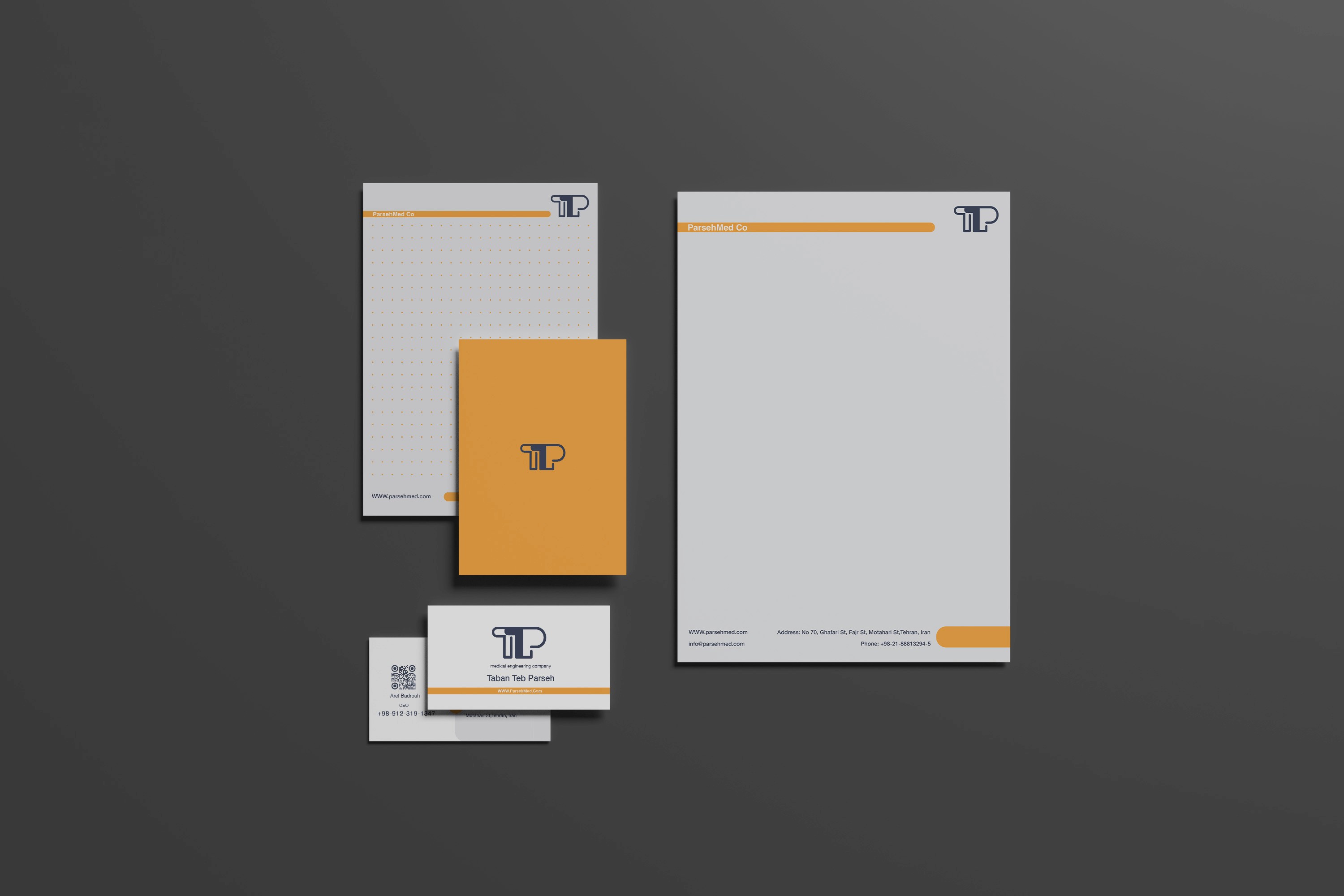
At the client’s request, I redesigned the logo for Taban Teb Parse, using the initials TTP as the main design element. I chose a navy blue and orange color palette, orange to convey energy and visibility, and navy blue to represent stability and trust. Both qualities are essential in the medical industry.

Following the logo redesign, I moved on to create the full stationery set for print, keeping a clean and minimal design approach throughout. To ensure color accuracy and high-quality results, I maintained close communication with the print house and used precise color codes during production.
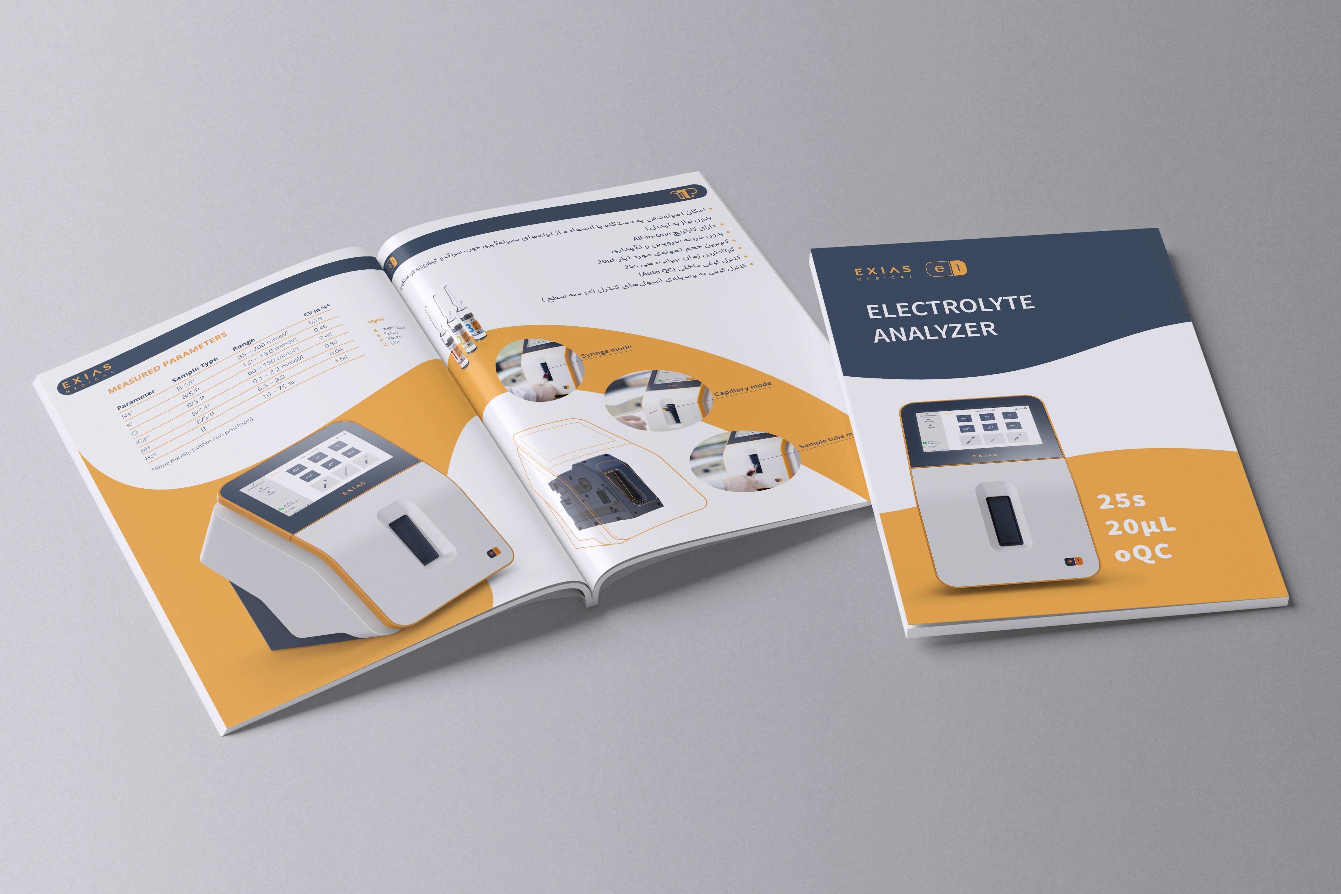
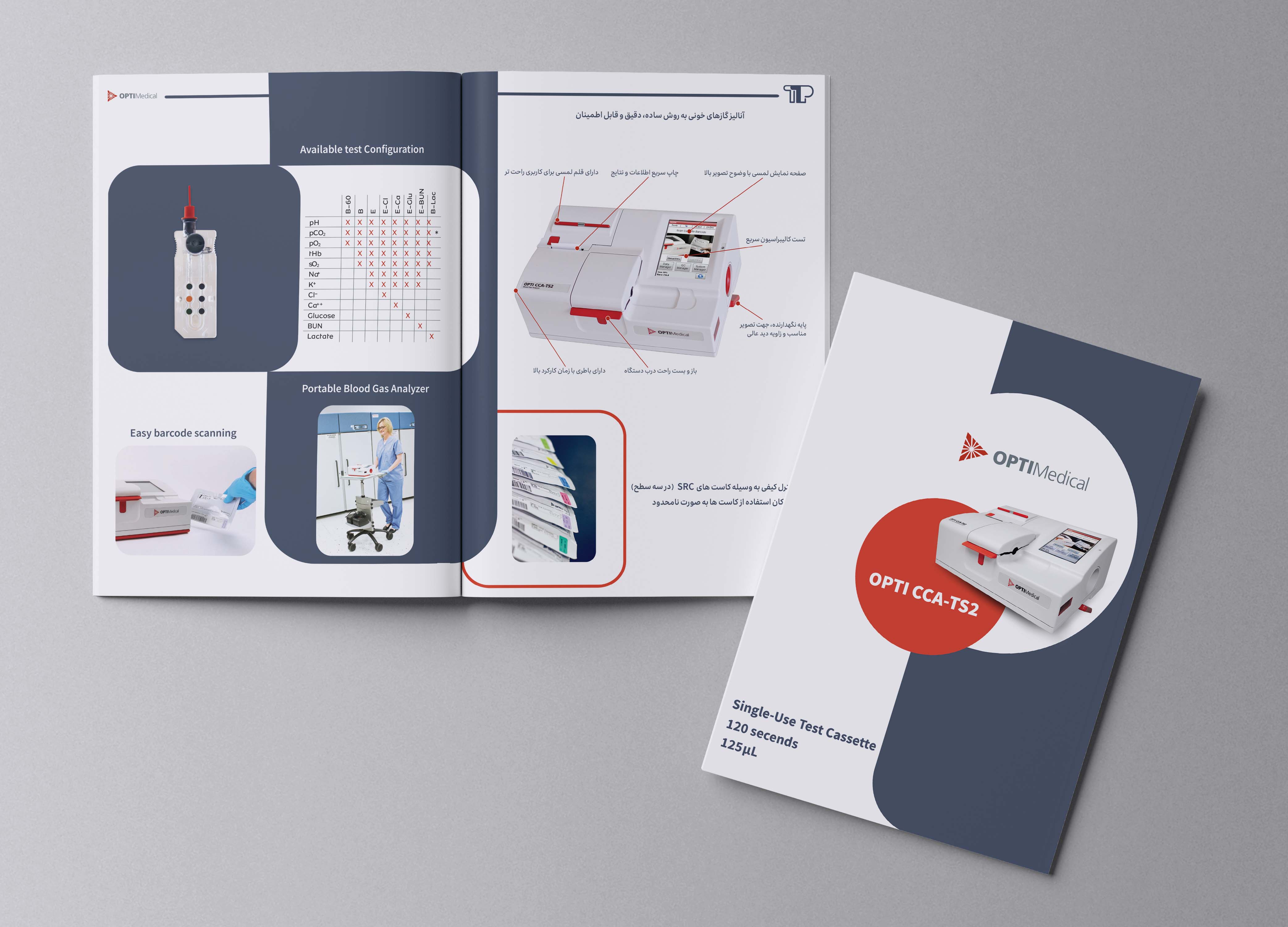
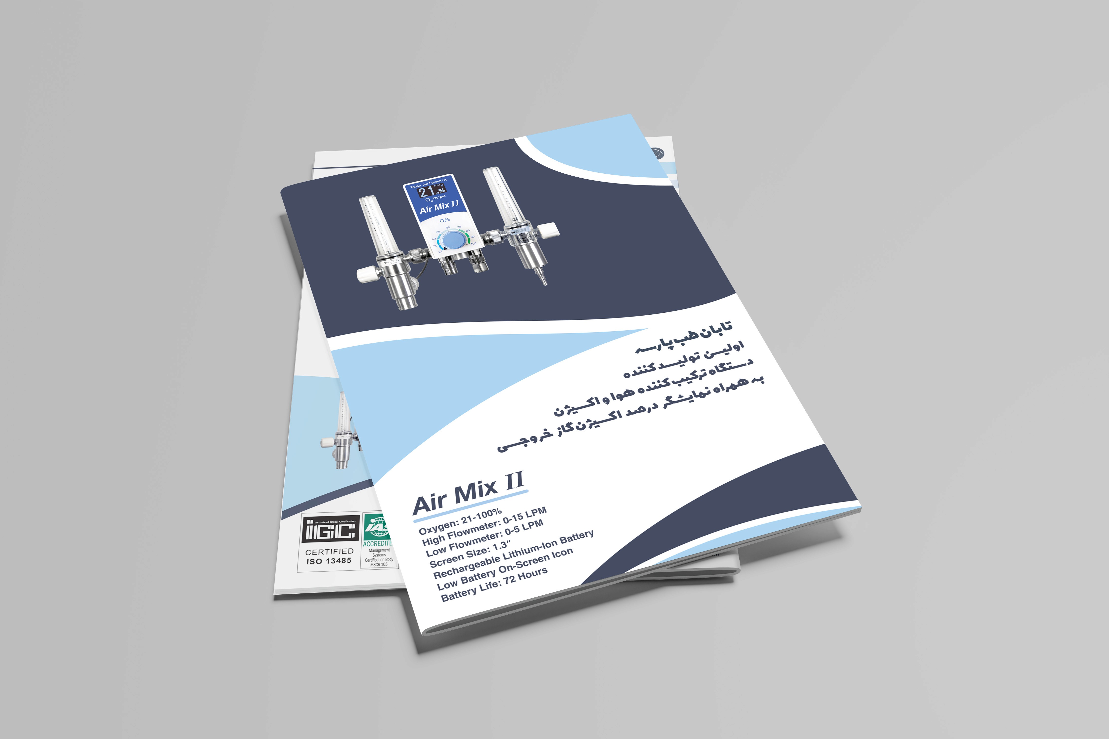
To design the product catalogs for print, I first carried out a product photography session to ensure I had high-quality visuals. These images were then used throughout the catalog layouts.
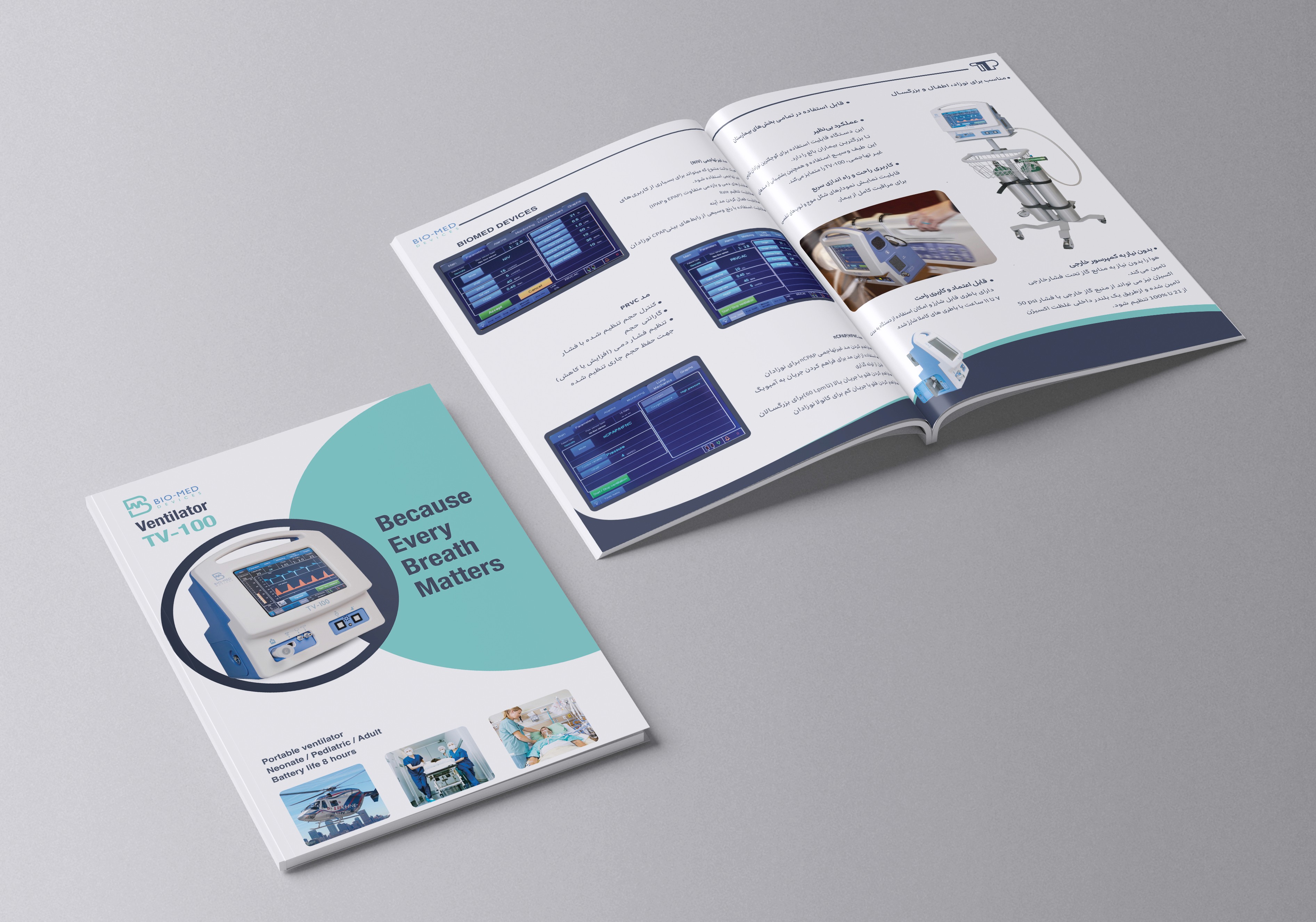
Each catalog was printed in a run of 5,000 copies for a medical equipment exhibition.
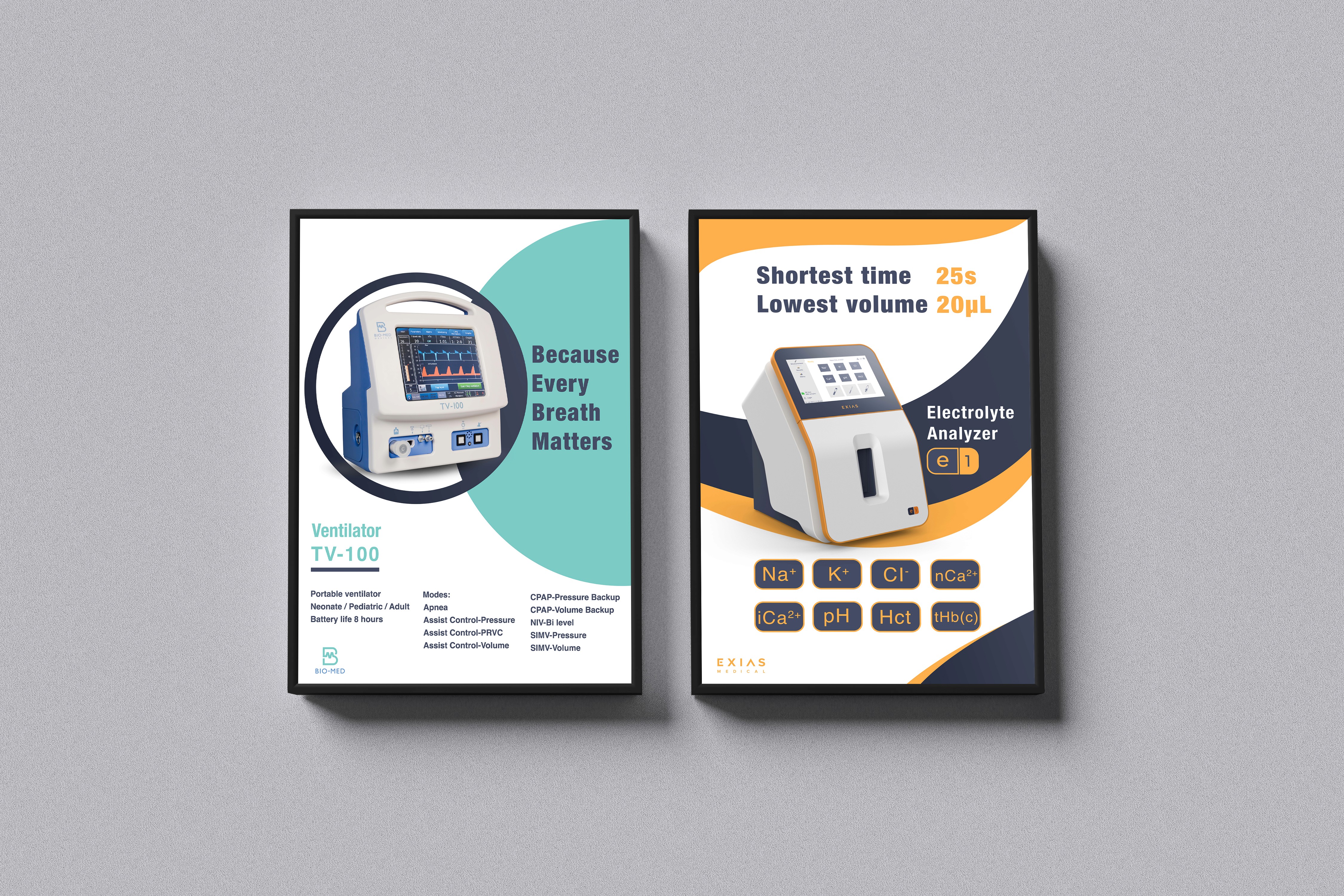
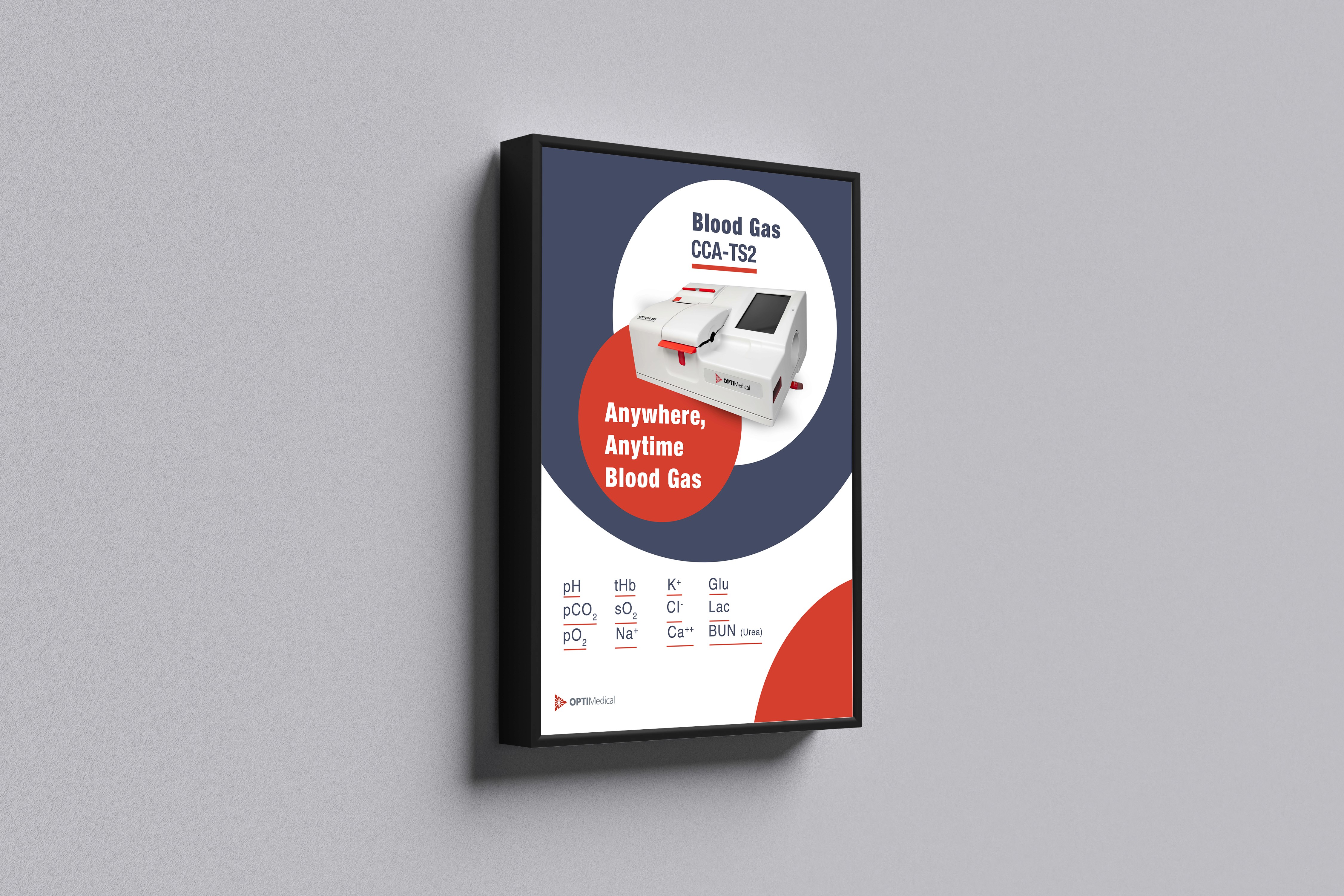
As you can see, I selected a unique color theme for each device, thoughtfully combining it with our brand colors to create a consistent yet distinctive visual identity.
I also designed a series of posters for the company’s interior space. I made sure to follow the same visual theme used in the catalogs for each device, maintaining a cohesive and well-organized brand presentation throughout all materials.