Company:
Taban Teb
Year:
2020
My Role:
UI/UX Design
Overview
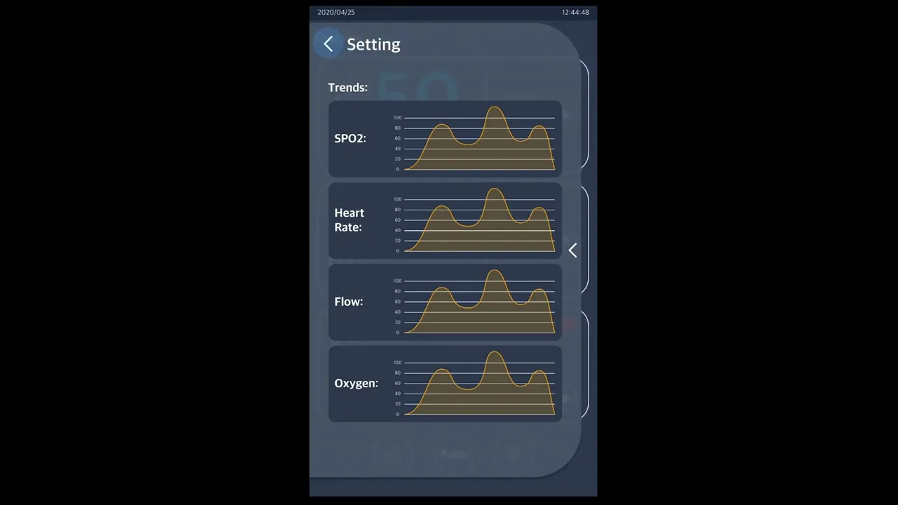
I designed a minimal, high-clarity interface for a hospital oxygen blender device, used to monitor and control oxygen flow, heart rate, and SpO₂.
This oxygen blender is used in emergency rooms and ICU settings to regulate oxygen supply to patients. Speed, clarity, and precision are essential. The interface needed to support quick access to data and settings, without overwhelming the user.
An interactive prototype was developed in Figma to test and present the full user flow. The final design allows healthcare professionals to act faster, with less friction, and more confidence — exactly what’s needed in clinical use.

Problem
Hospital staff often need to monitor and adjust oxygen levels, heart rate, and SpO₂ in fast-paced, high-stress environments. Existing interfaces on similar devices tend to be cluttered, overly technical, and slow to navigate, requiring multiple steps to access vital settings.
This creates unnecessary friction in situations where clarity, speed, and simplicity can directly affect patient care. The challenge was to design a UI that could deliver real-time information at a glance, minimize decision fatigue, and eliminate wasted time in critical situations.
Solution
I designed a minimal, gesture-based user interface tailored for medical environments.
Key design decisions included:
Glanceable Data Layout
Key vitals like oxygen flow, heart rate, and SpO₂ are displayed clearly with large typography and clean spacing for quick recognition.
Gesture Navigation
Swiping in four directions allows instant access to core settings, no menus, no back buttons, no confusion.
Dual Modes
Both light and dark modes were created to suit different hospital lighting conditions and reduce eye strain.
Consistent UI System
The interface was built using a strict visual hierarchy, calm color palette, and iconography optimized for medical readability.